
The Illusion of “Good Taste”
In most creative discussions, “good visuals” are easy to agree on. They are clean, balanced, contemporary. The typography feels right, the spacing is considered, the colors are restrained. Nothing clashes, nothing distracts. The work looks like it belongs.
And yet, much of it disappears the moment it is seen.
Not because it is poorly designed, but because it is indistinguishable. It follows the logic of good taste without introducing any tension, any specificity, or any reason to be remembered. In a landscape where visual literacy has increased dramatically — where audiences scroll past hundreds of polished compositions a day — correctness alone has very little weight.
The problem is not that brands are producing bad visuals. It is that they are producing acceptable ones at scale. And acceptability, by definition, does not create recognition.
When a Visual Carries Meaning
A visual begins to matter when it does more than support the message — when it becomes inseparable from it. When removing it would not simply make the content less attractive, but less clear.
This is where many brands underestimate the role of visual systems. They treat visuals as a layer applied after strategy, rather than as a structure that delivers the strategy.
Consider how Stripe approaches design. Their interfaces, dashboards, and documentation share a consistent visual logic: restrained color, clear hierarchy, precise spacing. None of it is visually loud, but all of it reduces friction. The design communicates reliability before a single line of text is read.
The visual system does not decorate the product. It explains how the product should feel.
Recognition Is Built, Not Designed Once
One of the more subtle misconceptions in branding is the idea that a strong visual identity can be created in a single moment — a logo, a color palette, a set of templates. In reality, recognition is not the result of a single decision. It is the result of repeated consistency over time.
This is where many otherwise well-designed brands begin to dissolve. In an effort to stay relevant, they adjust their visuals too frequently — chasing trends, experimenting with styles, adapting to platform norms. Each individual piece may look current, but the system as a whole becomes unstable.
By contrast, companies like Mailchimp have built recognizability through disciplined repetition. Their visual language — slightly offbeat illustrations, unexpected color combinations, a particular rhythm of layout — persists across campaigns and formats. Even when the content changes, the underlying structure remains intact.
Recognition, in this sense, is not about originality in each piece. It is about familiarity across many.
Clarity Before Expression
There is a natural tendency to treat visual content as a form of expression — a way to showcase creativity, to differentiate through style. And while expression has its place, it often comes at the cost of clarity.
When a visual prioritizes how it looks over what it communicates, it introduces friction. The audience has to interpret, decode, or simply move on.
The most effective visual systems tend to invert this priority. They aim to make understanding immediate, almost effortless. This does not make them less sophisticated — it makes them more precise.
A useful example can be found in Gong. Their visual content often translates complex datasets into simple, readable formats. Charts, annotations, highlighted phrases — all designed to direct attention quickly to what matters. The aesthetic is secondary to the function, but the result is still visually coherent.
Clarity, when executed well, becomes its own form of design.
The Role of Constraint
Another characteristic of strong visual content is limitation. Not in capability, but in choice.
When everything is possible — every color, every layout, every style — consistency becomes difficult to maintain. Without constraints, each new piece starts from zero, and the system never stabilizes.
Constraint creates identity by narrowing the field of options.
This is visible in how Notion constructs its visual environment. Neutral tones, minimal interfaces, restrained use of illustration — a system that deliberately avoids excess. The result is not just aesthetic cohesion, but a clear signal: this is a space for thinking, organizing, and structuring information.
The limitation is not a weakness. It is what makes the system recognizable.

Specificity Over Style
One of the more persistent mistakes in visual content is relying on style as the primary differentiator. Style can attract attention, but it rarely sustains it.
What sustains attention is specificity — visuals that are clearly tied to a particular idea, product, or way of thinking.
Generic compositions, no matter how polished, tend to feel interchangeable. They could belong to almost any brand operating within the same aesthetic trends.
Specific visuals, by contrast, carry context. They reflect real use cases, real structures, real constraints.
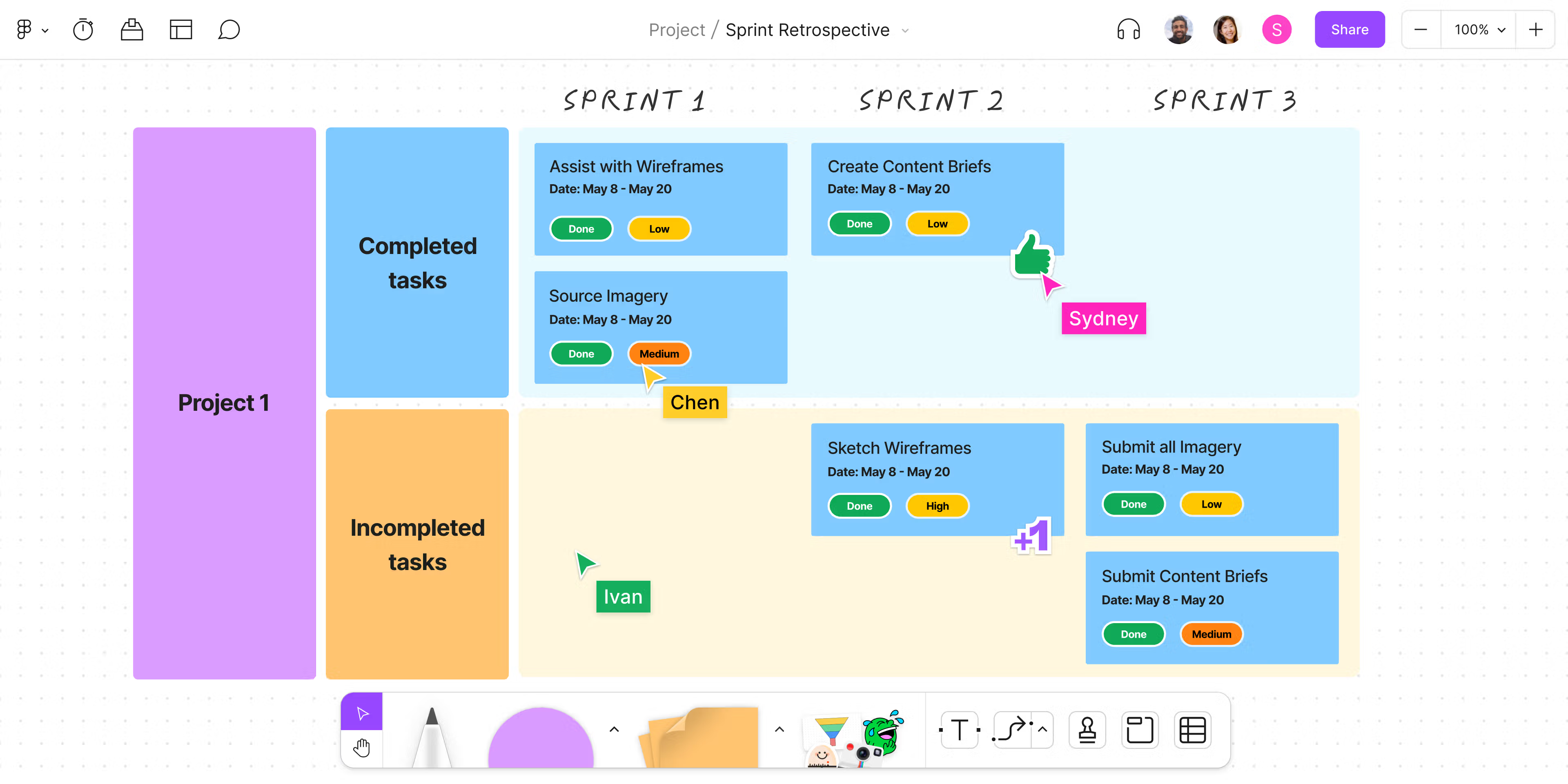
This is why product-driven visuals often outperform purely conceptual ones. When Figma showcases collaborative workflows or interface states, the visuals are not abstract. They show exactly how the product is used, by whom, and in what context. The design becomes informative, not just attractive.
Specificity reduces ambiguity. And reducing ambiguity increases trust.
What “Good Visual Content” Actually Means
When these elements align — clarity, consistency, constraint, and specificity — the definition of “good visual content” becomes less subjective.
It is not content that simply looks refined or follows current trends.
It is content where:
- the visual reinforces the message, rather than decorating it
- the system remains consistent across executions
- the design reduces effort instead of adding it
- and the audience can recognize the source without needing to be told
In other words, the visual is not an accessory. It is a carrier of meaning.
The Accumulation Effect
Over time, individual visuals begin to matter less than the pattern they create together.
People rarely remember a single post, a single layout, or a single campaign. What they remember is the feeling of coherence — the sense that everything a brand produces belongs to the same logic.
That coherence does not come from occasional excellence. It comes from repeated discipline.
And that is where visual content shifts from being a series of outputs to becoming a system. Not something that needs to constantly prove itself, but something that quietly reinforces itself with every new piece.
In that context, “good” is no longer a question of taste.
It becomes a question of structure.